Master AutoCAD: Ultimate Guide to Essential Shortcut Keys for Faster Drawing
2026-02-09How to Resize a Table in Microsoft Word: 3 Quick & Easy Methods
2026-02-10How to Easily Remove the Background Color Under Desktop Icons in Windows
I’ve always been particular about my desktop setup, and one thing that bugged me was the subtle background color or shadow under the icon labels. This feature, often called “drop shadows for icon labels,” is a visual effect in Windows that adds a semi-transparent background or shadow to the text under desktop icons to improve readability against varied wallpapers. It’s not a full solid color but a faint overlay that can make your desktop look cluttered or dated. Breaking it down, the “background color” typically refers to this shadow effect, which Windows enables by default for better contrast. It appears as a soft glow or tint around the icon text, especially noticeable on light or busy backgrounds. Without it, the text becomes fully transparent against your wallpaper, giving a cleaner, more integrated look.
One common question I get is: Why do my desktop icons have this background color in the first place? Well, it’s a built-in Windows feature designed to ensure icon labels remain legible no matter what wallpaper you use. If your background is a solid color, it might not show much, but on images or gradients, the shadow prevents the text from blending in too much and becoming unreadable. Another frequent query is: Will removing this affect my system’s performance? Not really—it’s a minor visual tweak that doesn’t impact speed or functionality; it’s purely aesthetic and reversible.
Doing this has several perks that I’ve enjoyed firsthand. First, it gives your desktop a sleeker, more modern appearance, especially if you’re using high-resolution wallpapers where you want the icons to blend seamlessly. Second, it allows for greater personalization, letting your chosen background shine through without distractions. Finally, on older or lower-spec machines, disabling such effects can make the interface feel snappier, though the difference is minimal in 2026’s Windows versions.
Step 1: Access System Properties Right-click on This PC (or My Computer in older versions) on your desktop or in File Explorer, then select Properties. This opens the basic system info window.
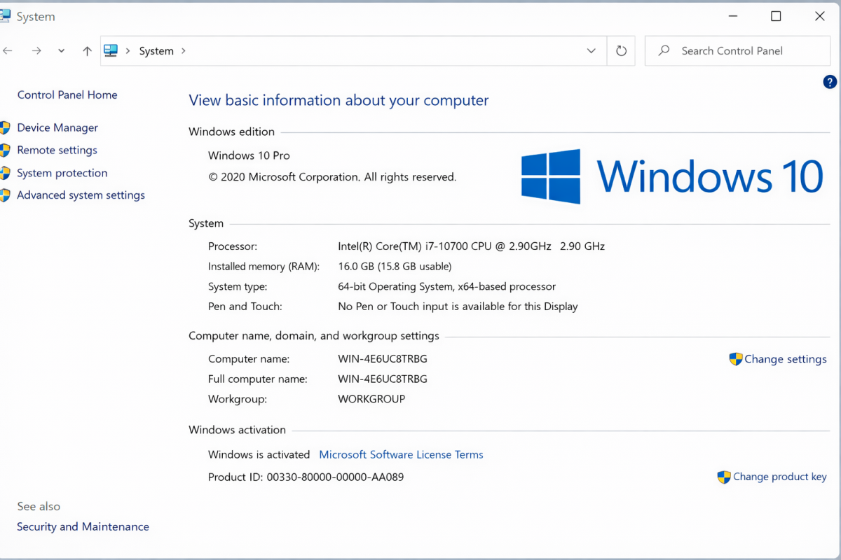
Step 2: Open Advanced System Settings In the System window, click on Advanced system settings on the left sidebar. You might need admin privileges, so confirm if prompted.
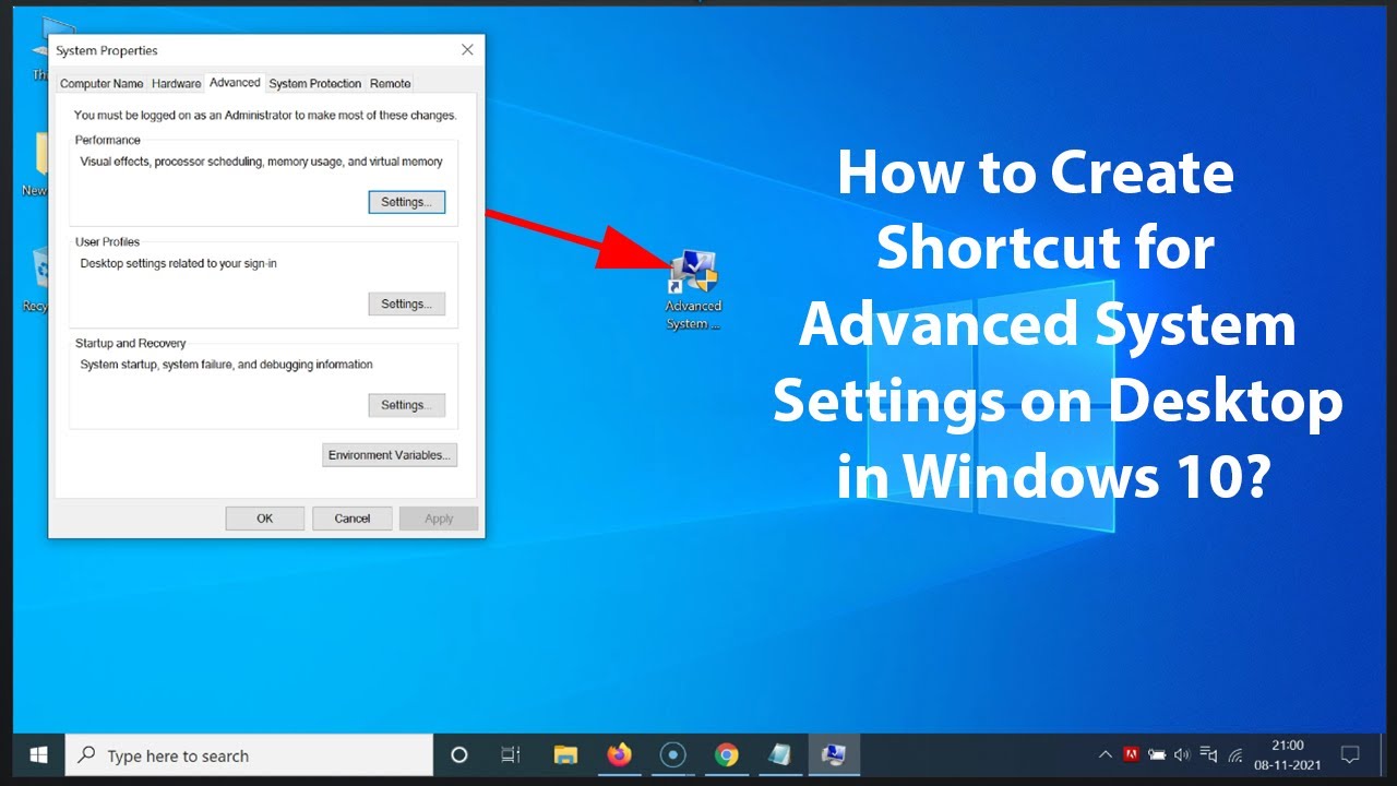
Step 3: Navigate to Performance Settings Under the Advanced tab, click Settings in the Performance section. This brings up the Performance Options dialog.
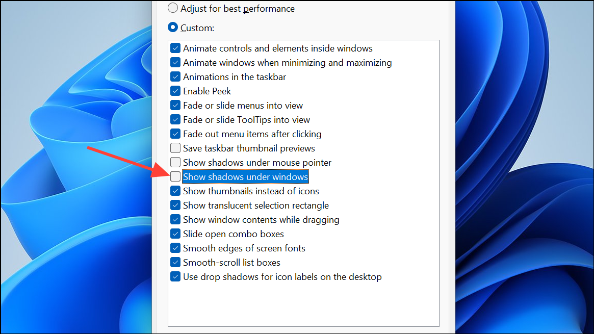
Step 4: Disable the Drop Shadow Option In the Visual Effects tab, uncheck the box for Use drop shadows for icon labels on the desktop. Then, click Apply and OK to save changes. Refresh your desktop by right-clicking and selecting Refresh if needed.
Step 5: Verify the Changes Head back to your desktop and check the icons—the background shadow should be gone, making labels appear directly on your wallpaper.
In my first test on a Windows 11 machine with a vibrant photo wallpaper, the before version had noticeable shadows making text pop but look bulky, while after, it integrated perfectly, enhancing the overall aesthetic without losing readability.
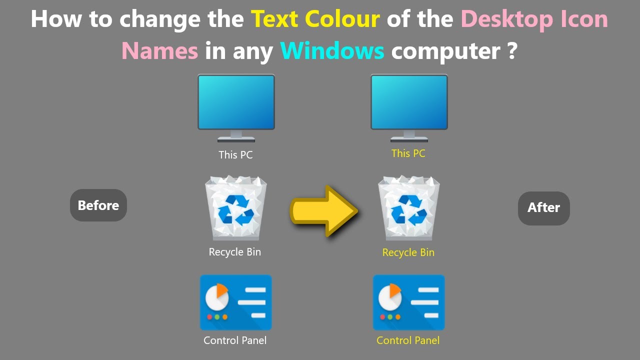
Another time, on an older Windows 10 setup with a solid blue background, removing it made the desktop feel minimalist and cleaner, though on very light backgrounds, I had to adjust text color for contrast.
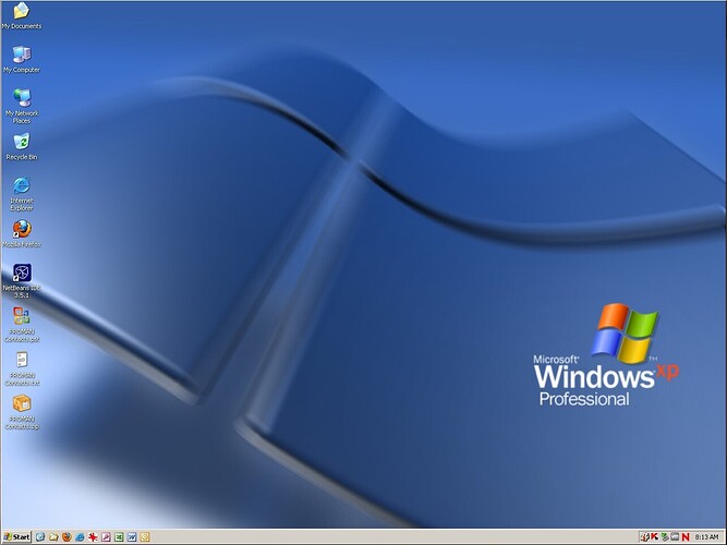
Finally, when I tried it on a high-res 4K display, the result was a seamless blend that made my custom wallpaper the star, proving it’s a quick win for personalization.
