What to Do If Excel Can’t Sort?
2014-05-08How to Fix Photoshop When It Can’t Complete a Request Due to a Program Error
2014-05-10What to Do If Photoshop’s Color Settings Cannot Be Synchronized and Won’t Run?
Photoshop’s color settings are a crucial part of its color management system, which handles how colors are interpreted, displayed, and converted across various devices like monitors, printers, and other software. This system relies on ICC profiles, which are data files that define color spaces such as sRGB, Adobe RGB, or CMYK. Synchronizing color settings refers to aligning these profiles and policies across Adobe Creative Cloud applications, ensuring that a color like a specific shade of blue appears the same in Photoshop, Illustrator, or InDesign. The problem of inability to synchronize often stems from issues like file permission errors (e.g., locked configuration files), incompatible software versions, missing Adobe Bridge integration, or conflicts with Creative Cloud syncing. When this happens, Photoshop may display error messages during launch or when opening files, such as “Could not synchronize the color settings,” leading to inconsistent color rendering that can disrupt workflows for designers, photographers, and print professionals.
What causes the color settings synchronization warning in Photoshop? The warning typically appears when the color management configurations differ between Adobe applications, often due to manual changes in one app that aren’t propagated to others, or when Creative Cloud fails to sync properly because of network issues or outdated software. This can result in colors shifting unexpectedly when moving files between programs. What are the risks of ignoring unsynchronized color settings? Ignoring it can lead to color mismatches, where an image looks vibrant in Photoshop but dull in Illustrator, potentially causing errors in final outputs like web graphics or printed materials, wasting time on revisions and affecting professional quality.
Fixing the synchronization issue ensures consistent color representation across all Adobe apps, reducing discrepancies that could alter how images appear on different devices or in print. This leads to more reliable workflows, saving time on color corrections and improving overall accuracy for tasks like photo editing, graphic design, or prepress preparation. Additionally, it prevents unexpected shifts in color profiles, enhancing collaboration in team environments where multiple users work on the same projects.
Step 1: Launch Adobe Bridge Open Adobe Bridge from your applications folder or via the Creative Cloud desktop app. Bridge acts as the central hub for synchronizing color settings across Adobe suite.

Launch Adobe Bridge
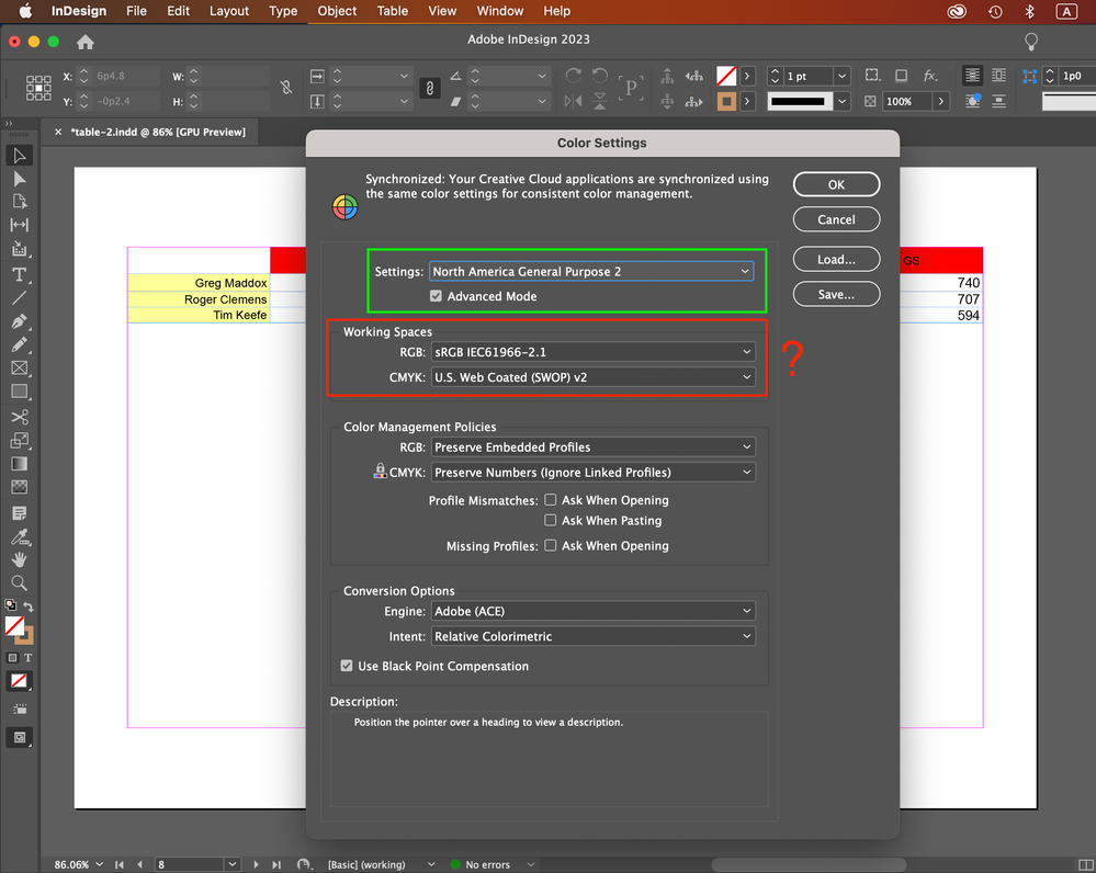
Step 2: Navigate to the Color Settings Menu In Adobe Bridge, go to the top menu bar and select Edit > Color Settings. This opens the dialog where you can choose and apply standardized color configurations.

Solved: Re: color setting in Adobe Bridge
Step 3: Select a Color Settings Suite In the Color Settings dialog, choose a preset like “North America General Purpose 2” or another that matches your workflow (e.g., for web or print). This ensures compatibility across apps.

Solved: Re: color setting in Adobe Bridge
Step 4: Apply the Settings to Synchronize Click the “Apply” button at the bottom of the dialog. This will sync the selected settings to Photoshop and other Adobe applications, resolving the error if it’s due to misalignment.

Solved: Re: color setting in Adobe Bridge
Step 5: Restart Photoshop and Verify Close and reopen Photoshop. Go to Edit > Color Settings in Photoshop to confirm the synchronization warning is gone and the settings match what you applied in Bridge.
In one case, a freelance graphic designer troubleshooting a mismatched color issue in a client project used this method and found that colors now aligned perfectly between Photoshop and InDesign, allowing them to deliver print-ready files without further adjustments, cutting their revision time by half. Another example involved a photographer who fixed the synchronization error before a batch edit session; post-fix, their images maintained accurate tones across editing and export, resulting in client approval on the first proof and avoiding costly reprints. Finally, a design team at a marketing agency applied these steps during a collaborative campaign, leading to uniform color outputs across team members’ workstations and streamlining their approval process.

